Why I don't trust most neuroscience results
I don’t trust results about brain state
I know. Internal state is all the rage, but I just don’t really trust the results – I think they’re mostly artifacts. Don’t get me wrong. I believe in “states” of the brain and I believe those will manifest as changes neural activity. I’m just highly skeptical that I can trust most empirical result I read. Others have written about how our statistical tools are poorly suited for these questions. My collaborators and I have discussed how important it is for how we interepret results on movement-related signals ( see Box 2). But in general, I’m pretty bearish on experimental neuroscience right now because of pervasive data quality issues and a lack of attention to addressing them. The main problem is there is a major mismatch between the methods neuroscientists have available to them and the questions they are asking.
There are data quality issues everywhere in science and systems neuroscience is no different. This has only gotten worse post “Big Data”. Call me old fashioned, but I think that we need to know whether a spike came from a single neuron or not if we are to rule in and out different neural codes. More importantly, right now the field is excited about scientific questions where data quality really matters. As we push into naturalistic (read, “uncontrolled/unconstrained”) and “internal state” questions, we need to be able to trust the data. And right now, I don’t think we can.
Data quality issues in spike datasets
This is a post about a specific type of data quality issue and how pervasive it is. I will write separate posts about quality issues in behavior, but this time it’s about spikes. There are plenty of artifacts in other types of data, for example calcium imaging. And I’m not going to touch fMRI because that horse (salmon) is alread dead.
This post is about spikes. Although I am going to spend ALL of my time talking about the International Brain Lab’s data, I in no way think this is a problem unique to the IBL. In fact, I know they are on the forefront of trying to solve these issues. But they happened to release a really nice dashboard for exploring their data, so it’s easier to use it as an example. Everything here is genearally true of the field. That’s what is so great about the IBL, it represents a large collection of labs, so this is a fairly representative slice. If you’re a Bayesian and you’re trying to figure out how much to weight the evidence I present here, the sheer number of labs in this consortium and the fact that they are one of the main drivers of rigor and reproducibility systems neuroscience means you should give it a fair amount of weight. If anything, much of experimental neuroscience is WORSE than this. This should nudge your prior.
The IBL is aweseome
Let’s start off by saying that the International Brain Lab data dashboard is the most impressive dashboard for inspecting data in neuroscience! By far! I mean, you can see where every recording sessions happened. It’s visualized as a probe inserted in a brain. And when you click on that probe, you can see all the meta data about that session.
After selecting a session, you can not just see the meta data on the right, but you can scroll down and explore that actual data. I think this is one of the coolest things I have seen in a long time in neuro.
Sorry to sound like a broken record, but that’s really impressive. This is the kind of thing that I think (hope) we’ll see more of as AI tools help us all build generative User Interfaces.
Here, you’ll see me navigate through one session. You see the population spike raster from the entire recording. And below, you can even click on individual trials.
The problem
But this where the awesomeness stops. This is a post about problems. The first dataset I clicked on (and the one I’ve shown you here) has signatures of data quality issues that are common in acute multi-electrode array recordings and can be seen in the population spike raster. I’ll note these are present in practically EVERY dataset in the IBL dashboard. I struggled to find one that did not have this problem.
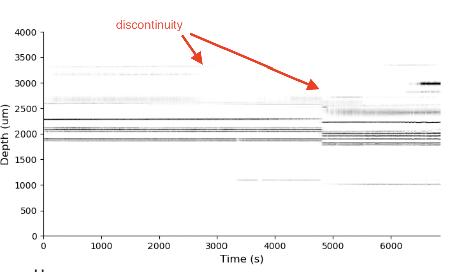
Each row of this raster shows the spike times of a “unit” from the recording. Time is on the x-axis. These are the results of “spike sorting”, where raw voltage traces are converted into the times and identities of action potentials from a population of neurons. This is pretty normal for what a spike raster looks like. Importantly, these are often not shown like this in papers. Again, this is what is so amazing about the IBL. The level of transparency is incredible. But, this raster has signatures that reflect the presence of a major artifact that makes many scientific questions (e.g., about “brain state”) difficult if not impossible to answer.
I’ve highlighted the visual feature I’m talking about in the figure. The red arrows point to discontinuities in the recording. At each of those red arrows, an abrubpt vertical shift in the raster is present. Some neurons have disappeared. Some have a appeared. At those discontinuities, it is no longer the same raster before and after. It has been shifted.
When this type of visual signature is present, something happened. It could be that the brain “state” changed, but more likely the animal moved or the probe moved. This is what we call “electrode drift”. How can we tell?
Thanks to the incredible dashboard, we can click into individual “good” units and see the spike waveforms and investigate whether there are signatures of drift in the electrode (i.e., not in the brain state).

Below, you can see all of the relevant information about this unit.
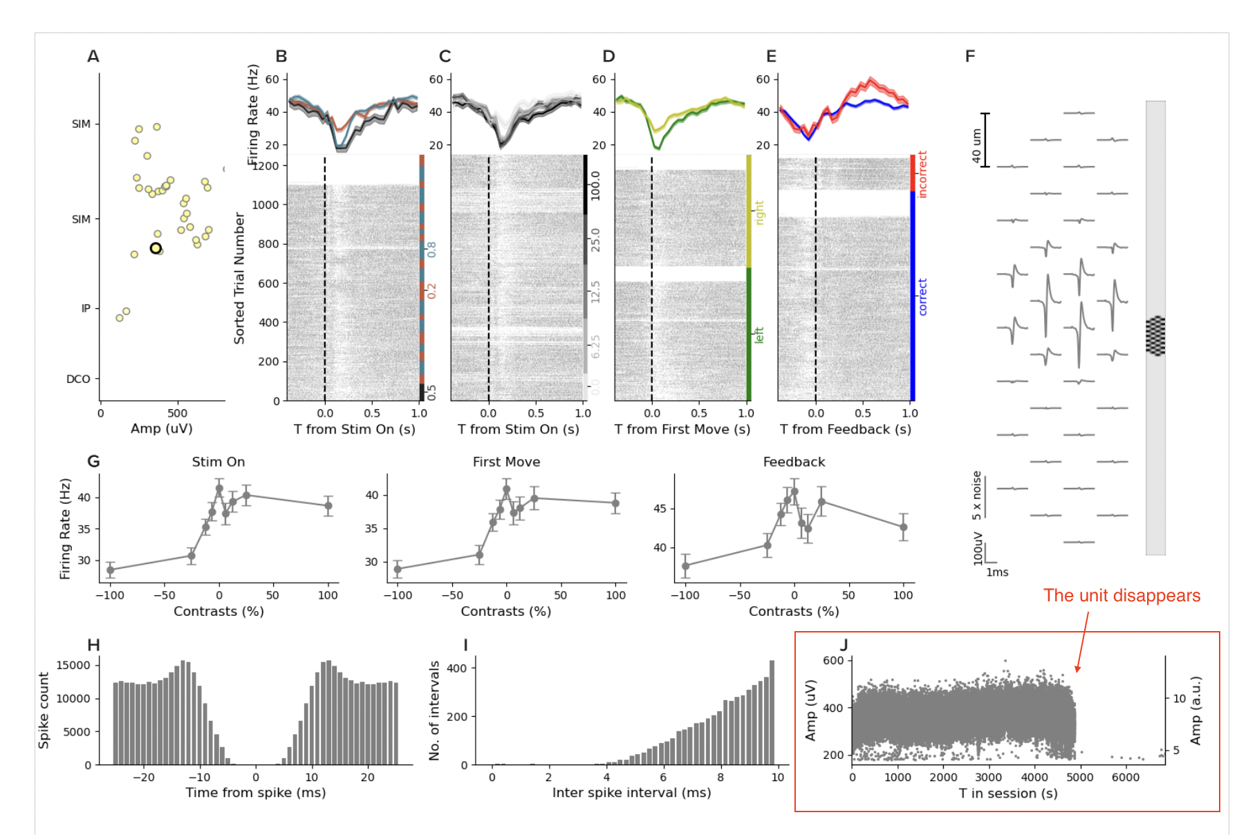
Panels B-E show the spike raster conditioned by task events. Panel F shows the spike waveform positioned on the probe. You can see that the waveform is visible across many channels, which assists spike sorting SNR. Panel G shows behavioral performance. Panel H and I show us the inter-spike interval distribution and support the claim this is a “good” unit as it has a refractory period consistent with real neurons…
And then we get to the panel that can tell us whether something is up with the discontinuities we saw, panel J. Panel J shows the amplitude of the spike waveform over time. I’ve highlighted it with a red box. You can see a cluster of points that is pretty stable over time, until the second discontinuity, and then, the unit dissappears. Of course, it’s possible the brain state changed, and this neuron stopped firing. But how can we tell?
The electrode drifted
If we click other units in that session, we can find some that appear after the discontinuity and some that disappear. It’s hard to find units that survive. That is all consistent with an abrupt shift in the array. But, when we find units that fire throughout the whole session, they have absolutely insane drift. Take this one for example:
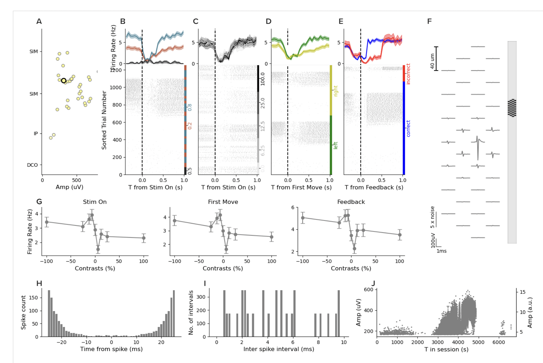
This unit has a very low waveform amplitude and low firing for the first 2000 seconds. Then it goes silent. Then the waveform grows and the firing rate increases, and then it disappears until the 6000 second mark when it reappears. Now, when I saw this, I thought for sure that this must not be a “good” unit. So I scrolled back up and then counted the units and sure enough, this one is labeled “good”. But across the board for this entire session, none of the good units are stable over the whole session and many have massive drift throughout.
The problem is pervasive
I turned on the “show advanced metrics” tab and kept clicking around different sessions and units and the pattern of drift is in practically every session. I’m just going to show a few more examples so you get the idea.
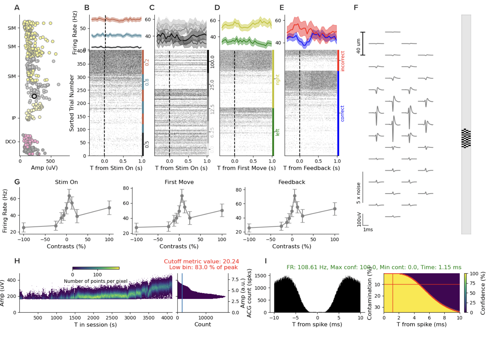

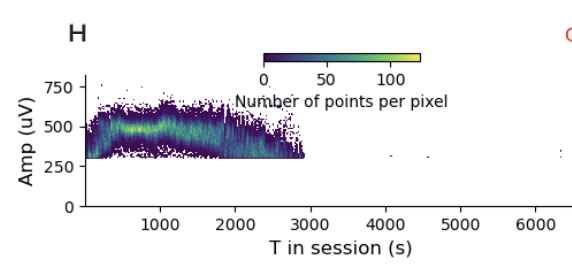

It’s hard to find a stable, well-isolated unit. I think that’s a problem. There are some questions where it is less of a problem. If you are using spike-triggered averaging to measure receptive fields, then you are simply asking about the stimulus distribution conditioned on spikes. It is kind of less of a problem if you miss some spikes. You reduce your power, but don’t get the answer substantially wrong. However, if you are using likelihood-based models or, even worse, asking questions about internal states, where you didn’t randomly (i.e., causally) manipulate the state, this is not a good thing.
Consequences
This is not a problem that is unique to the IBL. In fact, they’re probably in better shape than most small labs that are collecting this type of data. But it IS a problem. The field has been improving the methods in this space, but we should really think hard about whether we trust ANY of the science that has come of these methods in the last 10 years. I don’t. I don’t think any of this will become textbook. And I think that’s a problem.
The bigger problem is that because it is so pervasive, individual labs are incentivized to ignore this problem and publish using state of the art methods. If you actually only reported on the true stable single units in your data, 1) you wouldn’t have hundreds or thousands of neurons anymore, and 2) you’d be biased towards subsampling the units with big spikes. Thus, I think it’s a race to the bottom where everyone is only holding themselves to the standards of the field, because if they held themselves to higher standards, they wouldn’t publish anything and they’d be out of business pretty fast.
So what do we do? Well, for one, we need to invest heavily in data quality and spike sorting metrics. These are initiatives the IBL has been pushing on and they should become more standard. Impressive drift correction algorithms can help, but they cannot recover neurons that were lost.
But the more important thing, and more difficult selling point, is to SLOW WAY DOWN. We are collecting data much faster than we can analyze and we are asking questions that are outside of the scope of statistical tools we have. We (the NIH) should fund the analysis of existing datasets at a much higher rate. And we (the NIH) should fund theoretical work that puts bounds on what must be the case if certain assumptions are true (I’ll get to that in another post). The only way out of the mess we’re in is an incentive structure that rewards quality over quantity. I don’t see that happening. But I hope it does.